A company’s Logo is an essential part of its corporate identity, its the Face of your brand and should be easily recognized by clients. So when the Biggest software company – Microsoft – revealed a new logo after 25 years of using the old corporate logo – This had to make news.
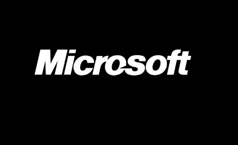
In this post, I’ll take you down memory lane and explore what Microsoft Logo looked like decades ago and how the design has evolved over time.
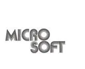
The Original Microsoft Logo was made in 1975 – I wasn’t even born then..
And finally, the new redesigned Microsoft Logo that conforms with the Windows 8 Operating system silky feel – 4 colorful squares – Red, Green, yellow and Blue depicts the company’s diverse products.
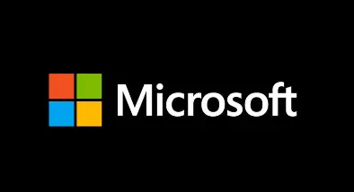
Why the new Logo? The release of Windows 8 OS for PC and phone marks a new Era for Microsoft. You’d attest to this if you’ve used the new OS, so it’s expected that the Logo evolves to represent the New Microsoft.
Hope this article has been helpful, you can drop a question or contribution in the comment section below.